Monday, 31 January 2011


Sunday, 30 January 2011
Portfolio Reviews: To Do List
Given the feedback received from Si Scott and Alex Atkinson in last weeks portfolio reviews, I have given myself a mini action plan to complete prior to February 10th - the D&AD portfolio review event:
Fedrigoni
01. Condense down to a single double page spread.
02. Mock up contextual networking event.
A4 Only Exhibition
01. Condense down to a single double page spread.
02. Propose bluetooth technology for digital distribution.
03. Include photographs from the actual event.
Typeface Design
01. Remove tools typeface and biscuits typeface IF...
02. Additional brief for Belt Up Lad is completed prior to Feb 10th. (doubtful).
Creative Networks
01. Add photographs from actual event if I can acquire decent quality ones. The ones supplied by Bridget at present aren't from inside the talk itself which is a shame.
Additional
01. Photograph British Linguistics screenprints and put in.
02. Print Amazon Publication at Team Impression, photograph and put into portfolio. (Quote is expected Monday morning or Tuesday morning at the latest).
03. Devise an opening page. Type driven layout? Big central logo?
-
All of the above I believe should be achievable except the completion of a new brief using the Belt Up Lad typeface. This could have been possible, however the yearbook and Garry Barker experimental publication pitches take significant priority over the coming two weeks.
Friday, 28 January 2011

Alex Atkinson Portfolio Review
As with Si Scott last week, today's portfolio review with Alex Atkinson was extremely beneficial and thought provoking in terms of how I could improve my portfolio in order to make it the best that it possibly can be. I again prepared questions that I felt I needed advice on, particularly in response to what Si commented upon last time around. This was mainly to do with the contextualization of design work and what the most appropriate way of presenting it would be. Essentially, am I presenting my work in an appropriate manner or do I need to work towards showcasing it in real life environments more than what I have done already.
As we went through the work brief by brief there were positive and negative (well, areas that could be pushed further) aspects for each. They were as follows:
Fedrigoni Paper
+ Nice, strong concept behind the brief.
+ Exploration of print finish is both relevant and well executed, especially for Fedrigoni.
- Your opening page is not the strongest image, so revise how you present the brief.
- As the concept is the driving force behind the brief then you need to show this more. To elaborate:
Condense the brief down to a single double page - you don't necessarily even need to present the poster. Mock up a real life interactive shop / showroom window and demonstrate how the networking event would operate. If time allows then also mock up another monthly event so that there is something to compare to the planes.
A4 Only Exhibition
+ The expansion of the original brief is effective and shows good appropriation skills.
+ Effective to have poster examples with you in addition to the photographs. This allows the interviewer to gain an insight into the process and the tangible qualities.
- Remove the stationery as it doesn't add to the brief much.
- Also remove the discs. This idea is a bit archaic. Instead propose a new forward-thinking idea whereby the guests may receive your digital deliverables via bluetooth - like 02. Or even a new technology that doesn't exist yet, be open minded.
- Include the photos you have from the exhibition itself. This context is important and allows the viewer to understand what the deliverables were actually designed for.
Typefaces
+ How they are presented is absolutely fine, you don't need to re-approach the delivery through a use of sentence in my opinion.
+ The smaller sentences in the corner are effective in showing how the type may read.
+ Belt Up Lad is really strong and lends itself to be used in a real life context.
- Take out the tools typeface as this has been done so many times. The Objectified DVD by Gary Hustwit (design by Build) sort of put it to bed as such.
- Also take out biscuits purely because it isn't as strong at the Belt Up Lad typeface.
- Take the Belt Up Lad typeface and use it as a springboard to complete a new brief. Something like an NSPCC campaign, something quite dark and sobering. A brief that will demonstrate that you have thought in depth about a cultural topic.
Creative Networks
+ Excellent to demonstrate a brief that has gone through to professional print.
+ Also excellent to include a real life version of the flyer.
- Include photos from the talk if available as they will boost the contextual referencing side of your portfolio.
Overall Comments
+ Strong portfolio, work well presented and professionally documented.
+ Good to include actual printed artwork such as the flyer.
- Condense your briefs down. One double page per brief.
- Add more briefs, but that will come over the coming month(s).
- Use first page as a title page as opposed to an actual project.
Thursday, 27 January 2011


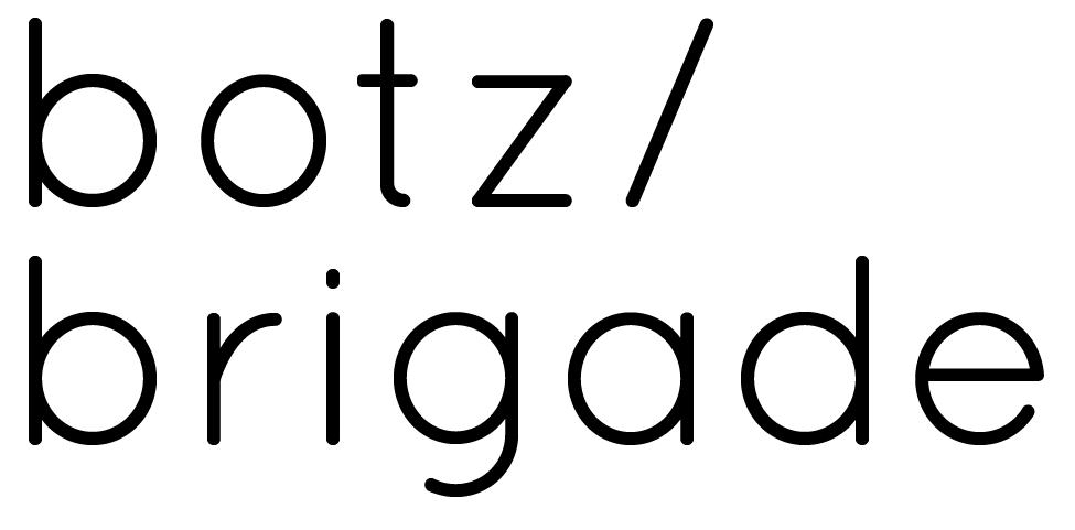
Botz Brigade: Client Feedback
Hi Liam,
I have managed to have a look through the logos you sent through and have shown them to my partner. We like the feel that you are trying to go for, the simplicity and clean look is something we think is working well. We have a few suggestions that we would like you to explore though if possible...
So, could you try and bring the b's close together like 'bb' and then add some colour to one of them... Possibly purple? Also try out a border and toy with some form of robot eye in one of the b loops?
Cheers,
Charlie.


Subscribe to:
Posts (Atom)
