Sunday 27 February 2011

Max Rushton: Logo Vectoring

Original (small jpeg):


Vectored:

Friday 25 February 2011

Garry Barker: Griffo Classico Invoice

Garry Barker: Griffo Classico

Garry Barker: Client Meeting 02

This morning Dave and I had a meeting with Garry to discuss our progress over the last week. Overall it was very positive.

Taking down our stuff from the Footprint visit, Garry was most notably keen on the format of the Paperback folder as it removed the trouble of our previous mock up (the use of glue). Without this element the supplied folder could potentially be sent over flat-packed and assembled on our side. This would reduce cost enormously, or at least free up some finance for other areas of production/print finish.

Also of interest was the quality of print provided by the Risograph method. Much like screen-printing a 100% perfect ink coverage is more or less not achievable, but can at times be desirable - as is the case for us. Garry was quite impressed with the hand rendered quality that the ironically digital process provided. I can't help but feel that this will enhance Vickie's and Charlotte's methods of processing the provided imagery.

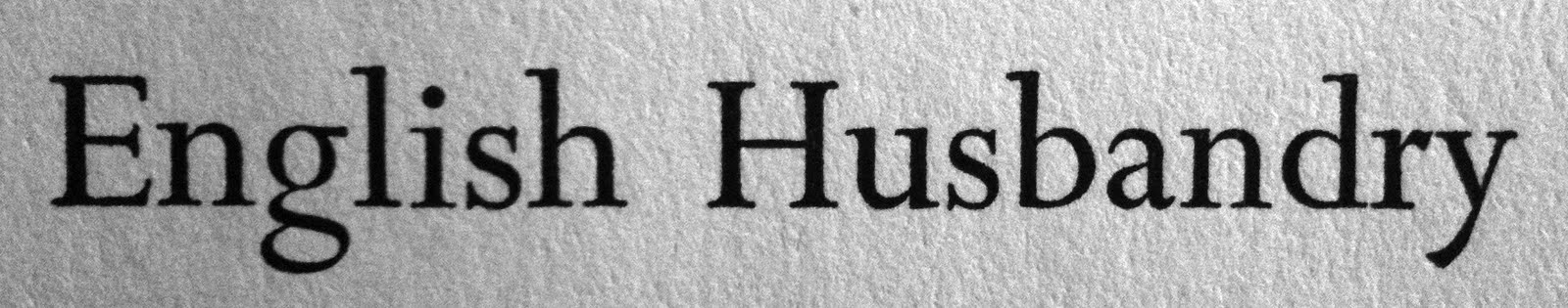
Furthermore, having seen the two typefaces that we had narrowed down, Garry was in fact really set on using Griffo Classico due to the 'edge' that it provided over Minutia. In his words, it felt more classic and slighlty hand-crafted with a dark twist. Pretty much what his work is like. Having discussed this with him it makes perfect sense, although at the time both Dave and I were commenting how we would have perhaps gone for Minutia if it was left to us because of the nature of the industry. We are both obviously pleased with the final decision though.

And so the to-do list from this meeting is as follows:

01. Await to receive quote back from Footprint.
02. Gain samples, specs and quotes from Paperback.
03. Purchase licence for Griffo Classico (£120) and invoice Garry.
04. Begin image treatment with the girls returning.
05. Experiment with layouts for newly provided text and images.
06. Clarify time for next meeting once Vickie and Charlotte return.

All-in-all good progress.

Wednesday 23 February 2011

Max Rushton: Client Discussion 01

In response to the email send through by Max a few days ago, I got in touch in regards to producing his business card. I was mainly interested as I liked his work that was on show and as I am dealing with Fine Art a lot of the time anyway (Yearbook) I thought it would be a good move to get involved further.

After agreeing to let me loose on his business card Max emailed through again earlier today with the assests and ideas he had for me to work with...

-

Hello Liam,

I leave for France tomorrow until the third of March so I will leave the making of the card almost entirely up to you (I will have internet assess where I am going so I can add my own input if I have to).

I would love for you to make a design that you are happy with by using the attachments I have sent with this email. These pictures compose of a variation or ideas for the front of the card and my latest painting which could offer insight into potential of the card, the images are not perfect images at all so if you just use them as inspiration and do not manipulate them then that is fine. The possibilities for the typography on the back is hard for me to contribute to, as is how the text should be structured.

The details I need on the card are as follows:

Maxwell Rushton

www.maxwellrushton.com
max.rushton@hotmail.co.uk
07868-xxx-xxx

(whether or not it is wise to write 'artist/painter' is your choice)

But please have fun, and I hope to hear from you soon.

Regards,

Maxwell Rushton.

-

Paperback Co-operative

-

Footprint: A Printing Co-operative

-

Thursday 17 February 2011

Creative Networks: Coasts Finals

Creative Networks: Coasts Client Feedback 03

Hi Liam,

The reverse looks great, again we will go with number one... the one without any imagery in the background.

Steve has altered the body copy slightly however, I will send it over shortly. If you could just alter the text to compensate for this then that would be great.

Many thanks

Bridget

Tuesday 15 February 2011

Creative Networks: Coasts Proposed Finals (Reverse)

Creative Networks: Coasts Development 03

Fine Art Yearbook: Client Meeting 02

Second meeting with the Fine Art Committee today, mainly put into place to clarify a concept and an overarching idea that could potentially inform some of the design direction elements.

The theme that the team has come back to us with for now is entitled 'Tacit Knowledge'. This is a concept that ultimately aims to unify the group through the idea that they have all become successful at what they do through practice - Tacit Knowledge is knowledge that cannot simply be taught, it has to be developed through experience and engagement with the process. It was described to us as like riding a bike. You can be told how to do it, but that doesn't necessarily mean that you instantly become successful at the physical engagement.

A runner up to this that the team looked at was 'If Someone Speaks...' - A phrase taken from a Freudian theory. As they ultimately didn't want to be related back to Freud this was dropped.

The group have given us permission to take the concept and run with it a little bit, as last year's team (Tom, Ollie & Angus) did. This element of freedom is appealing and something that the group and I will begin to work on immediately.

Looking ahead to production, the course has stated that they want approx. 2,000 copies in total for Free Range and other events - or whatever the maximum is that the budget forecasts. They don't really want anymore than this number though.

For now we are going to aim to develop the concept and put some immediate design decisions down onto paper as it were.

Next meeting: 12 o'clock - Friday 18th February, 2011.

Creative Networks: Coasts Proposed Final Front Revised

Creative Networks: Coasts Client Feedback 02

Hi Liam,

That’s more like it, we will go with number one please. It has been suggested that the date could go on the ‘front’ as well.

Many thanks

Bridget

Monday 14 February 2011

Creative Networks: Coasts Proposed Finals 02

Creative Networks: Coasts Development 02

Creative Networks: Coasts Client Feedback 01

Hi Liam,

My first impression is that it looks far too similar to the November flyer you created so I would advise a new layout and approach. The oversized, underlined text was used to good dramatic effect last time, but this is a more ‘inspirational’ event.

Secondly, the overlaid text is difficult to read and, you are right, the font doesn’t really say ‘internet’ to me.

Could you take a different approach please?

Many thanks

Bridget

Creative Networks: Coasts Proposed Finals 01

Front:

Back:

Creative Networks: Coasts Development 01

Front:

Back:

Thursday 10 February 2011

Fine Art Yearbook: APFEL & Turner Prize Catalogue

Turner Prize Catalogue that was brought along to the meeting with the Fine Art Committee. This I REALLY like, as do the others. I think it appeals to us graphics geeks a little bit more than they realize.

To re-cap, what they liked:

01. Customized sans-serif title font.

To re-cap, what we like:

01. Everything. (Ok, i'll expand)

01. BEAUTIFUL customized sans-serif title font.
02. Use of Courier (or something similar) for image info/nav text.
03. Weight of image vs type on overall layouts.
04. The simplicity and lightness of layouts.
05. Consistency in artist name location.

(All of the above are relevant reference for taking the yearbook forward).

Fine Art Yearbook: Creamier

As mentioned, this is Creamier publication by Phaidon that was brought along to the meeting by the Fine Art Committee.

To re-cap, they liked:

01. The coloured stock on the inside.
02. The type driven cover that contained the entire publication.
03. The use of spot varnish on said cover.


-

Packaging spot varnish detail: