Showing posts with label ISTD Mutton Quad. Show all posts

Friday, 3 June 2011

Thursday, 10 March 2011

Mutton Quad: Logo Explanatory Diagram

In response to Joe's feedback received this afternoon, I have quickly put together this explanatory diagram that outlines clearly how the Bowl Restaurant logo was put together from the actual bowl on the 'o' and the left-hand stem of the 'w'.


This in my opinion definitely clears up any confusion and helps to get the concept across straight away. The diagram will most likely be used on my impact board for submission.

Tuesday, 8 March 2011

Mutton Quad: Menu Content Finalised

Finalised(ish) content for the Bowl Restaurant main menu, again this took a lot longer than anticipated and as a result I am a bit behind schedule. I wanted to be close to a final resolve design-wise by now with this menu, but having run over slighlty I have only just begun generating ideas for the format and content layout.

As shown I have started adding descriptions to each dish, but I will most likely make this up as I go along in order to save a bit of time.

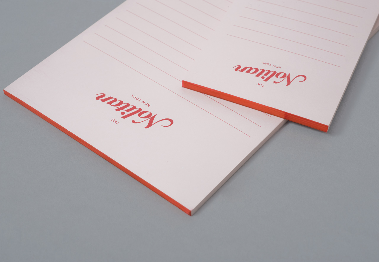
Mutton Quad: Nolitan Group

All of this Nolitan packaging/branding etc. is a bit out of context, but the principle is the same.

Very similar tone to the Frey and Ford stuff below. It's the decorative serifs that do it... I am going to avoid these from now on as they're tempting me to change the branding when it doesn't need to be altered.

The simple reason I looked at this was for the diversity of products that the branding was applied across. Obviously this is relevant to the brief.

I REALLY like the little notepads too. These could be very useful to reference whilst developing food order pads.

Definitely interesting to visualise how such a simple logotype can unify a range of products and potentially merchandise.

Mutton Quad: Frey & Ford

This Fray and Ford stuff caught my eye today also. It's very classy, but in a slightly different way to the Brompton branding... a little less snobby I feel.

The decorative serif together with the stripes remind me pretty much of an old style sweet shop. You know, when it would have been spelled Ye Olde Sweet Shoppe. The whole thing is a bit more friendly. This is something I haven't considered, but it's a bit late in the day for that. I've got my tone and I'm going to run with it. Confidence through conviction.

Anyway, main interest was the application of type without image - seeing how I can make use of the space I may have left over with a relative straight-forward menu.

Obviously the brand across different media is important, but thats pretty much a standard with this brief.

Mmmm... very nice identity though.

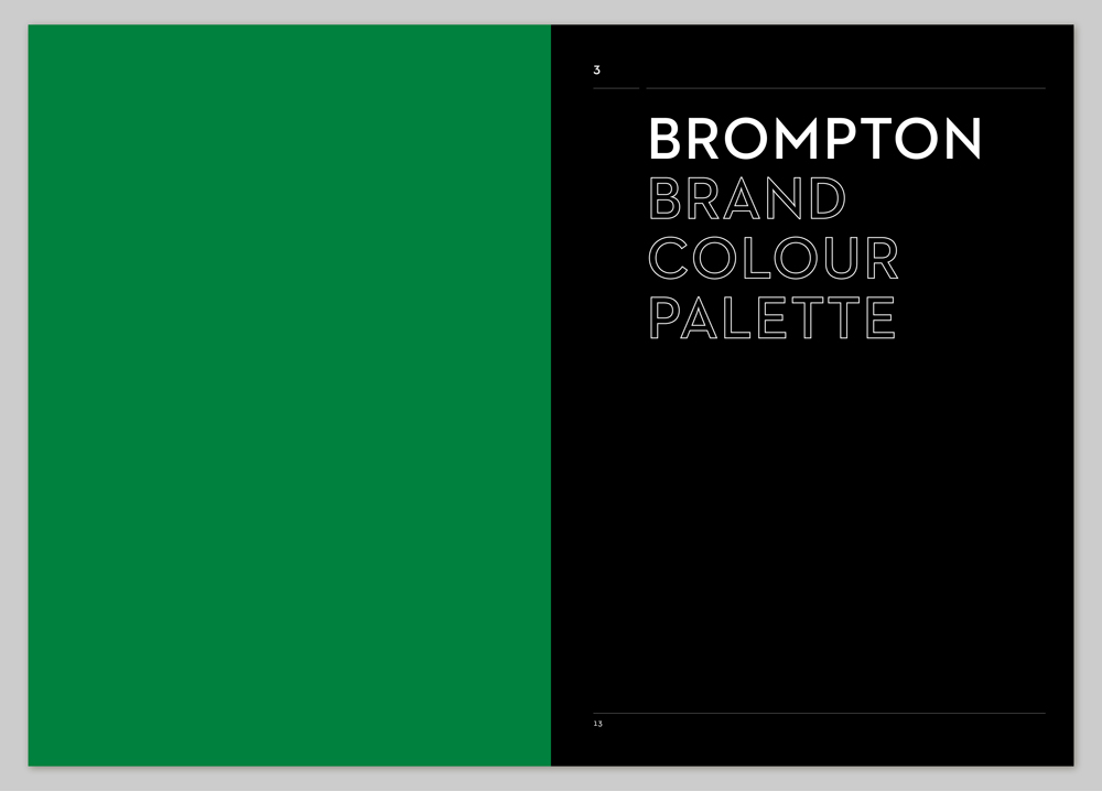
Mutton Quad: Brompton

Came across this stuff for Brompton which I found quite interesting. Very useful in seeing how to spec brand guidelines and such. This may be relevant for the ISTD submission boards themselves.

A few of the other design elements do relate as this is for the restaurant arm of the bigger brand (thats how I've understood it anyway, I may be wrong).

Particularly useful are the icons that could develop into signage given the context I am looking at.

The main reason this interested me though is for the typographic tone. It's almost spot on relative to what I am aiming to achieve. The little mail out flyer down the bottom is very classy. Black, white and gold... that may help it.

Sans serifs seem to be the way forward I think - this tied in with Baskerville should be quite classy? Tests to come...

Monday, 7 March 2011

Mutton Quad: Menu Content Development

This morning I spent roughly 2-3hrs developing the main menu content for Bowl. It's a little sad that all I have to show for my idea generation are these two sheets of notes, but it was a lengthy process that took a lot longer and a lot more effort than these notes show. (I will have to reference the websites and books that I used to extend my knowledge in detailed typographic terminology).

Anyway, my main aim (as previously mentioned) was to unite food and typography through common terminology - or terminology that at least shares a similar sound when you speak it... this is an aspect I have adhered to since the generation of the brand identity itself.

The key 'eureka moment' I feel that I've had is the idea to name each section of the menu under conceptually aware umbrella headings...

Opentypes / Starters
Truetypes / Main Meals
Postscripts / Desserts
Swashes / Drinks

I think this one strong feature of the menu that will definitely assist in the smooth-running of the layout/design process.

Lastly, the cheesey taglines that I have come up with so far such as:

Whats FFor DINner? and X-heighting Uppercase Dining! could all be used for promotional print based media that may extend the brief after the original ISTD deadline.

All-in-all a good mornings progress.

Friday, 4 March 2011

Mutton Quad: Canteen Menu

Like the Browns menu, this Canteen menu is mainly serving as a reference to existing dishes that I can modify. I know it's slightly wrong morally, but the restaurant isn't due to be made into a real business project so for now its ok.

Quite like the small selection here - it's more relative to how many dishes I am aiming to have on my own menu.

I can't gain access to the print based menus at present, so no reference to gain there. To my knowledge they're just flat sheets also... no folding.

To be confirmed...

Mutton Quad: Browns Menus

These are a select few menus from Browns.

I have mainly looked at these to reference dish names so I can begin to compile my own menu and reference typographic terminology.

Design wise they are okay. Well, alright... they're awful except the main menu. I quite like the format of that and it's an interesting hold. Having been there myself it feels about right given its context, so all good.

Overall the layout is a bit bland, although it is trying to get a lot of information into a small area...

With my menu, I'm currently thinking of using a flat sheet like the main menu here. I'm likely to keep it relatively simple - less folding and faffing about. The deadline is tight now and I have more important briefs to get completed. I need to be realistic.

I'm not going to have masses of content either like these examples. Certainly not enough to design multiple menus. It's likely that starters, mains, desserts and drinks will be the lot. Again I don't want to waste more time than what is necessary on this part, I want to get designing and keep the flow going. The concept needs to shine through though, it'll be a balancing act.

Finally, I'm not using image. No time and no need. I can't be doing with waiting to get permission to use pre-existing images and there aren't any photographers in the college at the moment who have photographs I can use.


Thursday, 3 March 2011

Mutton Quad: Logo Final

Mutton Quad: Logo Development

Bowl logo developed using the British sans-serif Gill Sans (Eric Gill).

Bracket was used in developmental stages to convey the shape of a bowl. This was rather unsuccessful and didn't tie the concept together well enough. It was therefore dropped.

In the end, the bowl shape was made from the actual bowl of the lower-case 'o' and the cutlery coming out of the top makes use of the lower-case 'w'.

Lower-case was used throughout as it felt more relaxed (as intended) and also provided a modern, classy feeling. This will come though further when used in the correct context as well.

My only worry is that the whole identity might connote the feeling of a Chinese/Japanese restaurant due to the bowl looking a bit like a noodle bowl. I'm confident that context and other design elements will balance this though.

Lastly, I also had an idea for a loyalty card that accumulated the size of the bowl stack... promotional devices like this aren't typically used in posh(er) restaurants, but I'd like to see how I could incorporate this.