Showing posts with label OUGD303dc. Show all posts
Showing posts with label OUGD303dc. Show all posts
Monday, 23 May 2011

Thursday, 5 May 2011


Saturday, 12 March 2011


Fine Art Yearbook: ABC Student Handbook
Having a trawl through some design studio websites this morning lead me to find this beauty by Your Friends; a Norwegian set up that consistently deliver considered typographic publication design. (I can forsee these rapidly becoming one of my favourites).
What I admire about this student handbook in relation to our Fine Art Yearbook is as follows:
01. A fine balance between type and image
02. Creative and experimental use of grid systems
03. Minimalist approach to typography
I have to say I also quite like the over-sized and unconventional page numbering system that enhances the boldness of the typesetting. Daring I think...


Lastly, the contrast between cover stock and content stock is an aspect I believe we should also try and deliver (budget allowing) for our publication. Your Friends have proved that this can work whilst maintaining a sense of coherence.
What I admire about this student handbook in relation to our Fine Art Yearbook is as follows:
01. A fine balance between type and image
02. Creative and experimental use of grid systems
03. Minimalist approach to typography
I have to say I also quite like the over-sized and unconventional page numbering system that enhances the boldness of the typesetting. Daring I think...


Lastly, the contrast between cover stock and content stock is an aspect I believe we should also try and deliver (budget allowing) for our publication. Your Friends have proved that this can work whilst maintaining a sense of coherence.
Wednesday, 9 March 2011
Fine Art Yearbook: Graphic Magazine
The advantages of posting the digital spreads of this Graphic magazine aren't really that great... I need to photograph Tim's actual copy in the studio at some point.
Either way, this has been strong reference material in terms of stock for the leaves of the yearbook. The pages are extremely light and achieve a really interesting transparency effect. It's not enough to detract from the work on one side, but it does allow the reader to catch a glimpse of what is coming up - something we all think is rather appealing.
We will take this to the meeting on Friday and see what the committee make of it. Hopefully they will like it as much as we do.


p.s the layout is pretty awesome to. Good source of inspiration.
Either way, this has been strong reference material in terms of stock for the leaves of the yearbook. The pages are extremely light and achieve a really interesting transparency effect. It's not enough to detract from the work on one side, but it does allow the reader to catch a glimpse of what is coming up - something we all think is rather appealing.
We will take this to the meeting on Friday and see what the committee make of it. Hopefully they will like it as much as we do.


p.s the layout is pretty awesome to. Good source of inspiration.
Fine Art Yearbook: Quicksand
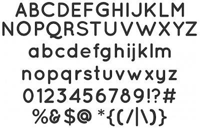
As we won't be able to confirm the use of Estilo until the meeting on Friday we have selected Quicksand as the title typeface to use until then. What this will allow for is a realistic progression with the layout development as the visual qualities are very similar between both typefaces.
To tell the truth, Quicksand is actually just as effective as Estilo and non-licensed (meaning that it's free). This -on top of the fact that you get the three different weights and a dashed version to boot- might well mean that this could get taken forward for the final publication.
The team and I both admire the light and delicate qualities it conveys - perfect for our concept. It is also very pleasant on the eye, which is never a bad thing.
Ultimately, the Fine Art Committee will decide. Both would work well we feel. (The different weights might be the deciding factor).
Light:
 Book:
Book:
 Bold:
Bold:
 Dash:
Dash:

To tell the truth, Quicksand is actually just as effective as Estilo and non-licensed (meaning that it's free). This -on top of the fact that you get the three different weights and a dashed version to boot- might well mean that this could get taken forward for the final publication.
The team and I both admire the light and delicate qualities it conveys - perfect for our concept. It is also very pleasant on the eye, which is never a bad thing.
Ultimately, the Fine Art Committee will decide. Both would work well we feel. (The different weights might be the deciding factor).
Light:
 Book:
Book: Bold:
Bold: Dash:
Dash:
Tuesday, 8 March 2011
Mutton Quad: Nolitan Group
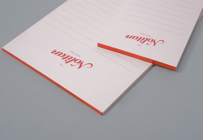
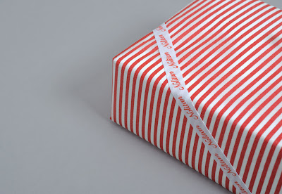
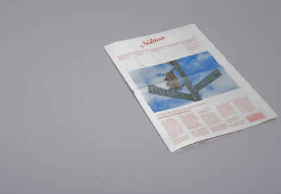
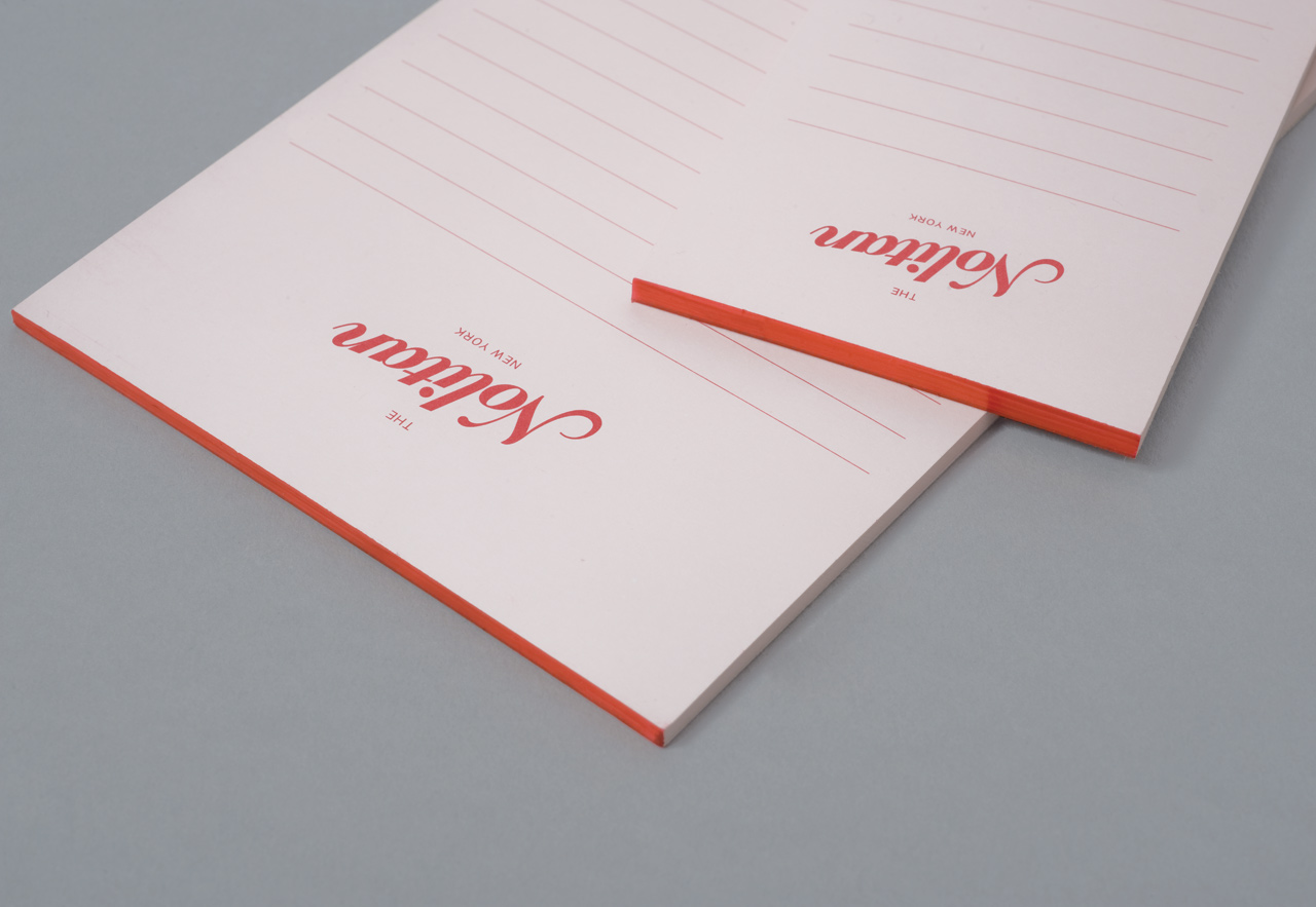
All of this Nolitan packaging/branding etc. is a bit out of context, but the principle is the same.
Very similar tone to the Frey and Ford stuff below. It's the decorative serifs that do it... I am going to avoid these from now on as they're tempting me to change the branding when it doesn't need to be altered.
The simple reason I looked at this was for the diversity of products that the branding was applied across. Obviously this is relevant to the brief.
I REALLY like the little notepads too. These could be very useful to reference whilst developing food order pads.
Definitely interesting to visualise how such a simple logotype can unify a range of products and potentially merchandise.







Very similar tone to the Frey and Ford stuff below. It's the decorative serifs that do it... I am going to avoid these from now on as they're tempting me to change the branding when it doesn't need to be altered.
The simple reason I looked at this was for the diversity of products that the branding was applied across. Obviously this is relevant to the brief.
I REALLY like the little notepads too. These could be very useful to reference whilst developing food order pads.
Definitely interesting to visualise how such a simple logotype can unify a range of products and potentially merchandise.




Mutton Quad: Frey & Ford
This Fray and Ford stuff caught my eye today also. It's very classy, but in a slightly different way to the Brompton branding... a little less snobby I feel.
The decorative serif together with the stripes remind me pretty much of an old style sweet shop. You know, when it would have been spelled Ye Olde Sweet Shoppe. The whole thing is a bit more friendly. This is something I haven't considered, but it's a bit late in the day for that. I've got my tone and I'm going to run with it. Confidence through conviction.
Anyway, main interest was the application of type without image - seeing how I can make use of the space I may have left over with a relative straight-forward menu.
Obviously the brand across different media is important, but thats pretty much a standard with this brief.
Mmmm... very nice identity though.


The decorative serif together with the stripes remind me pretty much of an old style sweet shop. You know, when it would have been spelled Ye Olde Sweet Shoppe. The whole thing is a bit more friendly. This is something I haven't considered, but it's a bit late in the day for that. I've got my tone and I'm going to run with it. Confidence through conviction.
Anyway, main interest was the application of type without image - seeing how I can make use of the space I may have left over with a relative straight-forward menu.
Obviously the brand across different media is important, but thats pretty much a standard with this brief.
Mmmm... very nice identity though.


Subscribe to:
Posts (Atom)
