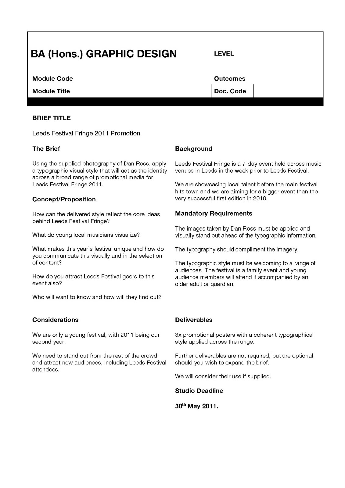
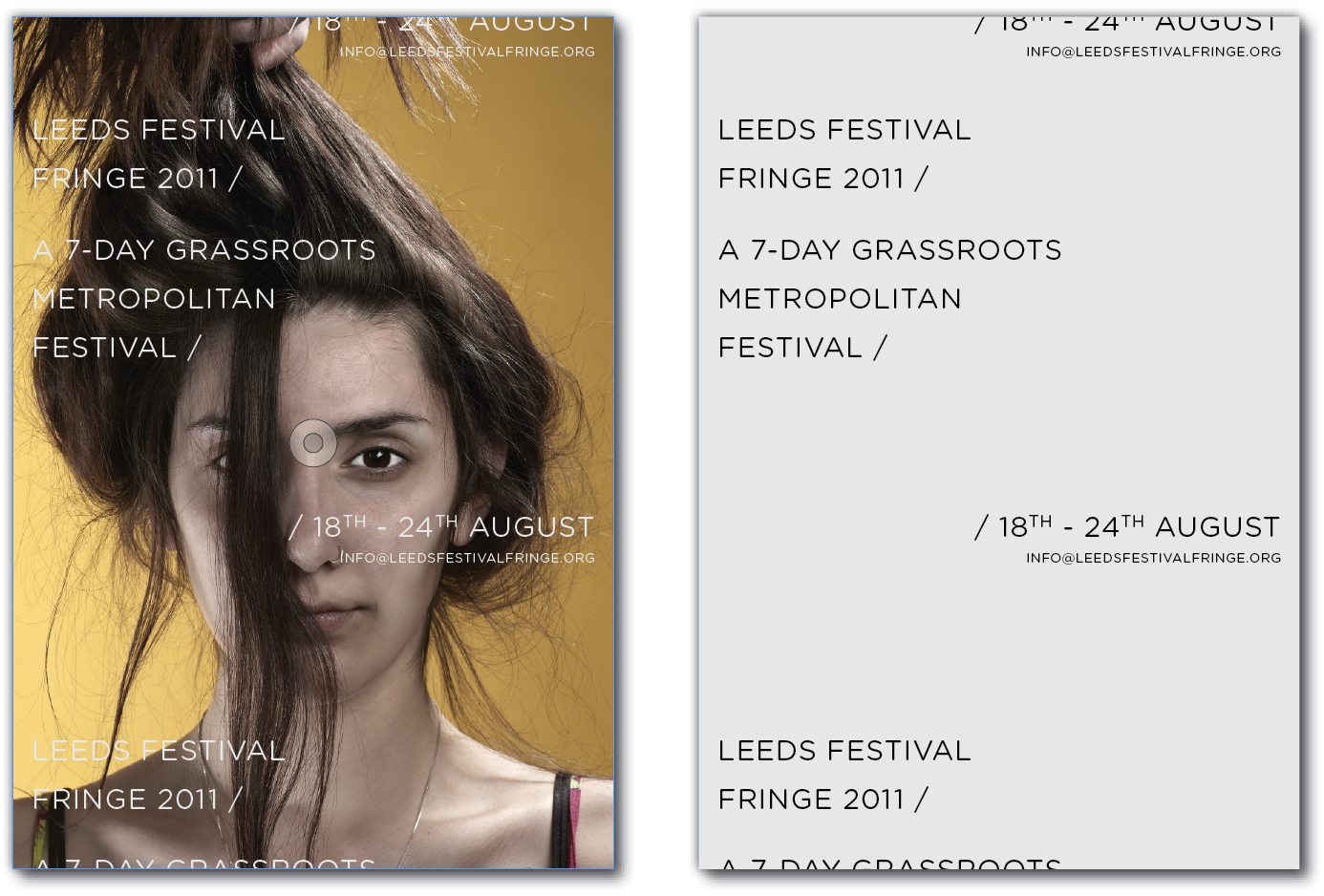
Apologies for not picking up on this sooner, the headline actually needs to read:
'Leeds Festival Fringe', 'Not Leeds Fringe Festival'.
Other than that, I would have to say that there's something just not sitting right for me...
I like the title in the top left and the use of a forward slash. I like how they tie into the concept. The email address along the bottom left also works really well; and I agree, I think we should work with a 10% tint in regards to the type.
I think you just need to play around with the copy in the middle and we won't be far away.
I get what you mean with the experimental layouts, but I don't think it works with the image; it kind of departs from the impact.
The typeface is spot on, but I think more of a slate grey would perhaps work. The white overpowers the image for me.
I also like the writing over the face but really we need the eyes/mouth/hair visible. Maybe centralised type, and space throughout the poster?
I like the positioning of the email address in the bottom corner, that works well. I also strangely think the logo looks alright, but this is upto you entirely as the client has said that it isn't majorly important to include this.
I'm originally from a little town called Lowestoft. It is pretty dull and full of quirky seaside culture. In term time I now live in Leeds and study Graphic Design at Leeds College of Art. On the side I also like to pursue drumming and the collection of rare vintage materials.