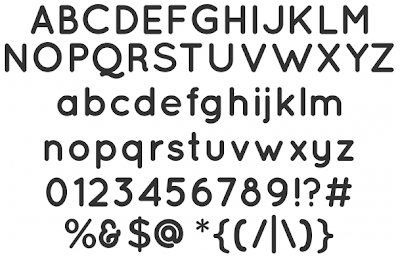
To tell the truth, Quicksand is actually just as effective as Estilo and non-licensed (meaning that it's free). This -on top of the fact that you get the three different weights and a dashed version to boot- might well mean that this could get taken forward for the final publication.
The team and I both admire the light and delicate qualities it conveys - perfect for our concept. It is also very pleasant on the eye, which is never a bad thing.
Ultimately, the Fine Art Committee will decide. Both would work well we feel. (The different weights might be the deciding factor).
Light:
 Book:
Book: Bold:
Bold: Dash:
Dash:

No comments:
Post a Comment