Very similar tone to the Frey and Ford stuff below. It's the decorative serifs that do it... I am going to avoid these from now on as they're tempting me to change the branding when it doesn't need to be altered.
The simple reason I looked at this was for the diversity of products that the branding was applied across. Obviously this is relevant to the brief.
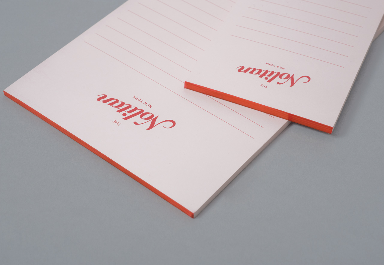
I REALLY like the little notepads too. These could be very useful to reference whilst developing food order pads.
Definitely interesting to visualise how such a simple logotype can unify a range of products and potentially merchandise.


No comments:
Post a Comment